What colours can communicate, why meanings vary, and how colour affects the way we see photographs.
What is colour psychology?
Colour psychology looks at how colours may influence feelings, attention and interpretation. Red may seem energetic, blue may seem calm, and black may suggest formality. But none of these meanings applies to everyone or every situation.
In photography, colour works alongside lighting, facial expression, composition and surroundings. A blue shirt cannot make a tense expression look relaxed, and a red dress does not automatically make a portrait romantic.
This article explores common colour associations and lets you experiment with how colours look. If your main question is what to wear, see my guide to choosing colours for a photoshoot.
Explore 16 colours
Choose a colour to see its common associations, other possible interpretations and an example of how it may appear in photography. You can also compare lighter and darker versions. These are starting points for interpretation, not rules.
Blue
Common associations:
Another possible reading:
In photography:
Change the shade to see how one colour family can look different.
All 16 colours at a glance
Blue
Calm, reliability, distance. Deep blue can also feel cold or lonely.
Red
Energy, affection, urgency. Red can also suggest danger or tension.
Yellow
Brightness, cheerfulness, attention. It can also suggest caution.
Green
Nature, freshness, renewal. Artificial green light can feel unsettling.
Orange
Warmth, activity, playfulness. Muted orange can feel more restrained.
Purple
Creativity, ceremony, richness. Pale purple may feel much softer.
Beige
Simplicity, comfort, understatement. Without contrast, it can look flat.
Brown
Earth, familiarity, warmth. It can also feel sombre or heavy.
Gold
Celebration, wealth, prestige. Metallic shine matters as much as hue.
Magenta
Expression, intensity, boldness. Large areas can dominate a scene.
Maroon
Depth, formality, warmth. Dark surroundings can make it feel heavier.
Pink
Tenderness, romance, playfulness. These are not gender rules.
Teal
Coolness, freshness, calm. Its meaning changes with context.
White
Openness, simplicity, ceremony. In some traditions it is associated with mourning.
Grey
Restraint, neutrality, quietness. It can also feel dull or distant.
Black
Formality, drama, strength. It can also be associated with mourning.
Culture and personal meaning
Colour meanings are shaped by culture, occasion, personal experience and surrounding details. Red is associated with celebration and good fortune in many Chinese traditions, but it can also be a warning colour. White may suggest a wedding in one setting and mourning in another.
Colour
Possible association
Why context matters
Red
Celebration, love or danger
A festive outfit and a warning sign use the same colour for very different purposes.
White
Cleanliness, ceremony or mourning
The occasion and cultural tradition can change its meaning.
Black
Elegance, authority or grief
A formal portrait and a funeral photograph are read differently.
I would not assume a colour has a fixed meaning for someone simply because of their background. A favourite colour, a family memory or a brand identity can be more important than a general chart.
Shade, intensity and context
The colour name is only the beginning
It helps to separate three things: hue is the colour family, such as blue or red; lightness is how light or dark it looks; and saturation is how vivid or muted it looks. A colour name alone does not describe all three.
Pale blue and deep navy belong to the same colour family, but they do not look or feel identical. Neither carries one fixed emotional meaning.
Try changing a colour
Move the sliders and notice how the appearance changes even though the basic hue remains blue. There is no correct emotional response.
Same hue, different appearance
This is a screen-colour demonstration, not a simulation of real fabric or photographic lighting.
Surrounding colours change what stands out
The amount of a colour matters too. A red scarf is a small accent; a red dress fills much more of the frame. Before deciding that a colour is too bold, consider where it appears and how much of the photograph it occupies.
A small red detail may attract attention in an otherwise muted photograph. The same red can be less noticeable in a busy scene filled with strong colours. Colour contrast affects where we look, but it does not determine what we feel.
Black and white changes the comparison
Removing colour can draw attention to shape, expression, texture and lighting. However, colours that are very different in a colour photograph can turn into similar shades of grey. Black and white is not automatically more emotional or more professional.
White versus red: a real photoshoot
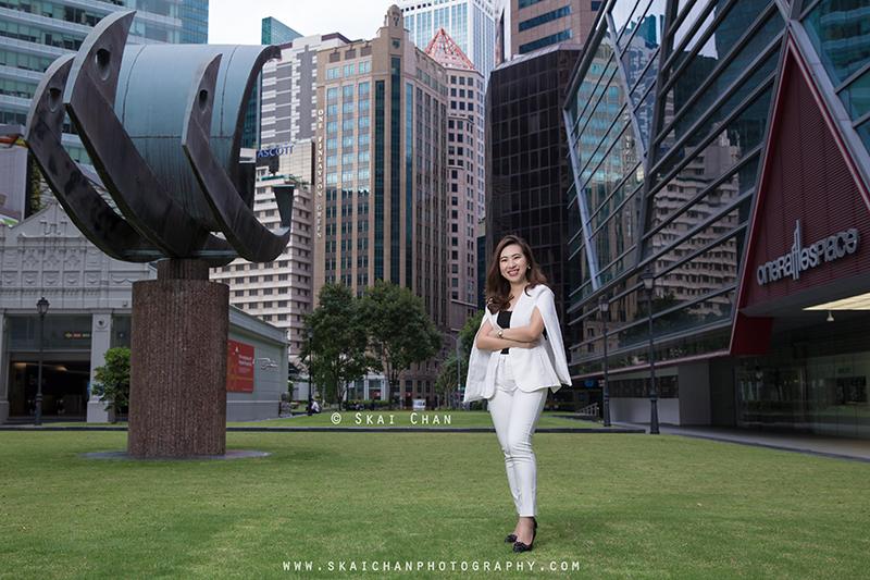
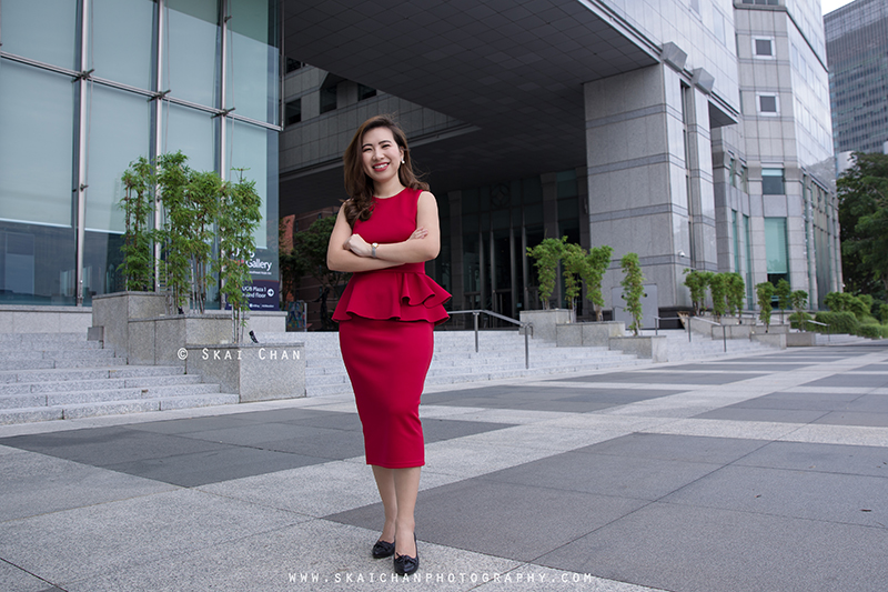
During a corporate lifestyle photoshoot with Ratna Juita in 2020, we photographed two outfits. Her white outfit appeared in the first set around Raffles Place Park and Boat Quay. She later changed into red for the second set at Boat Quay. I used a single strobe during the shoot to keep the lighting clean and controlled.
The red outfit stood out against its surroundings. The white outfit gives a different visual impression, especially in relation to the greenery and buildings. Look at both photographs before reading my observations.
There is no right answer. Choose what you noticed, then read my observations.
My observation: The red outfit was striking against the background in the second set. But these photographs also differ in framing, location, lighting conditions and background. They show how colour contributes to the overall impression; they do not isolate colour as the only cause.
Notice that Ratna is smiling with folded arms in both photographs. Her expression and posture remain important, regardless of the outfit colour.
Colour does not exist independently of light. The same clothing can appear different in direct sunlight, open shade and indoor lighting. The camera's white balance and subsequent editing also affect the final result.
The colour of the light
Warm light can give a scene a yellow or orange cast, while cooler light can shift its appearance towards blue. Mixed lighting is more complicated: different parts of the scene may be lit by sources with different colours.
The colour of the subject
Fabric, skin, background surfaces and nearby objects reflect light differently. A red outfit against a neutral background is not the same visual situation as red against a wall of similar colour.
Colour during editing
White balance and colour adjustments can improve consistency or create a particular finish. I prefer to consider skin tones and the whole scene rather than pushing one colour so far that the photograph looks unnatural.
Colour can influence attention and contribute to the atmosphere of a photograph. It is useful to understand common associations, but those associations are not fixed rules about personality, emotion or culture.
Look at attention: which colour catches your eye, and does it help you notice the subject?
Look at context: what do the expression, setting and occasion add to your interpretation?
Look at alternatives: would a lighter, deeper or more muted version change the impression?
For me, the better question is not simply what a colour means, but how it works with the person, lighting and surroundings in the finished photograph.
If you are preparing for a session, continue with my photoshoot colour selection guide. That article focuses on the practical choices rather than the psychology behind them.
♥
Enjoyed This Article?
I've been sharing photography tips and experiences since 2012. If this article helped you, here are a few ways to show your appreciation.

 Scan QR to visit this website